


![]()
![]()
![]()
![]()
![]()
![]()
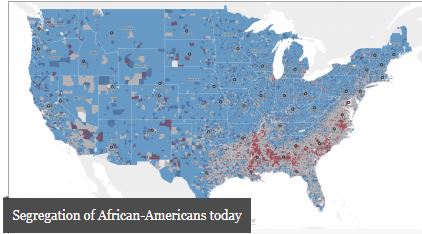
Startling new maps from the Anti-Discrimination Center vividly show the depth and breadth of residential segregation in the United States. Powered by Social Explorer, the maps allow the public to explore at the state, county, census tract, and census block group levels. Fifty years after the passage of the Fair Housing Act, residential segregation remains a fixture in American life.
These interactive maps uncover extreme segregation in ways that most previous mapping has not. Maps of the African American and Latino populations highlight areas of disproportionately low and disproportionately high concentrations of those respective groups, allowing a clear picture to emerge of the longstanding phenomenon of residential segregation.
As explained by Craig Gurian, Anti-Discrimination Center’s executive director, “While much progress towards integrating different communities has been made since 1968, the sad truth is that when you’re examining residential segregation in the United States 50 years on, areas of pronounced segregation persist all over the country.”
Built using data from the 2010 Census and the 2016 American Community Survey, the maps offer new context and detail about where African American and Latino populations live. The maps spotlight areas of group concentration and absences, showing the extent of segregation patterns and how they vary from place to place.
Users can navigate to a particular location on the map by using the geography search box, the panning feature, and the zoom tools. These map explorations illustrate the reach of segregation both across the nation and down to the level of specific neighborhoods.
Visit the Anti-Discrimination Center , a 501(c)(3) not-for-profit civil rights organization dedicated to the vision of “one community, no exclusion,” to start exploring the maps.


